Posts

Game Scene Final Project Post:

Image
 Week 3 Slideset available here . Here I realized I would have to reconstruct my house if I wanted to actually complete this project, which would be a time-suck. I tried to follow along with my original house as best as I could, but the entire reason why I had to do that was because my original house wasn't aligned with my UVs and had some custom pieces I wasn't able to pull out in time. It was ultimately easier to remake the house with the UVed pieces I already had. During this time, I realized I also needed to make a whole other house, but thanks to WoW's design allowing for palette swapping, I realized I had most of the pieces I needed. With some scaling of premade pieces, I was able to create a different house that would look coherent with the game world while also being not too difficult to make.   Here's the UV map for the farm; you can tell what parts of it were obtained from the House. My props were last minute; the only ones I could really feel proud of were th

170 - Postmortem - Group 7

Image
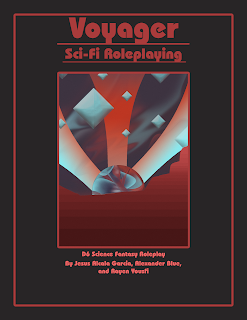
Group 7 - Voyager Voyager was supposed to be a game inspired by some single-player roleplaying games, where the focus is on journaling and writing out a story using dice and cards as an Oracle, to direct where the writing should go and provide a randomized, loose understanding of what the plot should be like. However, this changed during the process of development. Rayen wanted to include a math-like puzzle game, where players had to figure out how to navigate a grid of numbered cells within an exact amount of moves. I thought this would work perfectly, not realizing that it'd be extremely limiting when applied in that context. I wanted to avoid linearity and create necessary detours, twits, and turns. All with clever writing and a sense of ridiculousness informed by weird sci-fi analogies turned literal, similar to The Hitch-Hiker's Guide to the Galaxy, and old satirical point and click games like Space Quest. Some entries would be informed by sci-fi novels and other media. A

230 Eportfolio

Image
For my Firehouse, I ended up with this; my file got corrupted and I was left with a very small amount of pieces that had their material removed from them. Trying to import it into substance painter ended up breaking the model. Here's the end result of working on the Firehouse building. I successfully worked out the mesh and solved problems concerning non-manifold geometry on my own. I set up a second mesh with ID materials so I could try and address my problems with texturing; preparing myself ahead of time so I could texture properly, only for Maya to crash on the 11th hour when I tried to fix the FBX files importing half-invisible on substance painter. This was my first modeling project. I followed the instructions closely and ended up with a UV-ed and intelligently made trashcan. As I kept forgetting to keep track of my Trashcan, I would end up remaking it over and over again so I could keep up with the lectures; I think I made three trashcans total before settling on this one.

Onward: A postmortem

     Onward changed a lot over the course of development. Initially, the plan for it was to be a deck building card game where players took on the role of competing space-age businesses, trying to prove to shareholders that they were the better terraforming company. Players would assemble a biome through buying exotic creatures, and sabotage other players by introducing invasive species and engaging in hostile corporate takeovers. This would've been a strong game, however, the possible scale of it, the complexity of the mechanics, and the fact that it was far beyond our intended age-range made it unfeasible for our goals. 6-12 was a limiting factor, and it put us at an elementary school reading level and scope of knowledge. Games within this age-range tend to be simplistic in action, feature lots of visual language and bright colors to help with memorization, and have simple rules and turn order.       So, we simplified our game a lot. Instead of a complex, multi-stage turn wh

Postmortem - Firing Line

Image
 This about wraps up the final project for Group 4. Our goal was to create a version of solitaire that was faster and more fluid, with more of a focus on rapid movement and fast decision-making. We wanted to create a game that was more interactive and faster paced than solitaire, and by adding a timer we hoped to add necessary tension to the game to make it feel less like just shuffling cards around.  By creating a player-versus-game that emphasized timing, we hoped to attract the kind of player that's interested in tasks like speedrunning and cupstacking, emphasizing fast, precise, movements and rapid-fire decision-making abilities. The use of a running timer could attract Achievers, as faster times could easily be recorded thanks to the timer and there are many aspects of playing solitaire rapidly that can be optimized for the sake of that crowd.    The iterative design process could've gone better. I would've been happier making more versions of the game, and I feel like

Firing Line Process

Image
 So we've all accepted that nobody plays Solitaire online like it's supposed to be played. Ostensibly, Solitaire belongs to a family of single player games titled 'patience games', where the goal is to minimize moves and employ careful thought in order to successfully sort the deck according to the rules of the game. Most versions of Klondike solitaire that use points include penalties or limits for going through the deck with that purpose in mind.  But do you actually play it like that? Chances are, no. Whenever someone boots up Windows Solitaire, careful, precise, play isn't the name of the game. Typically, players will rapid-fire click or drag around wildly until something happens, especially when the game has reached a stalemate that can only be fixed by reshuffling the tableaus. Typically, the faster the better. That was the energy we wanted to bring into Firing Line. A timer was one of the first ideas proposed and it made playtesting fun and interesting, espec